Twenty Seventeen
Twenty Seventeen‘s business-oriented design includes a new video-header option and a front-page layout with panels drawn from your site’s pages. Customize the theme further with color palettes, a logo, social menu, and widgets.
Header Media
Twenty Seventeen supports both Custom Header Images and a Header Video. To modify either on your site, navigate to Customizer → Header Media.

For the Header Video, you can link to any video hosted on YouTube. If you have a Premium or Business Plan, you also have the option to upload your own video in .mp4 format. Smaller file sizes will help make sure your site is loaded quickly, so try to optimize your file to reduce its size as much as possible. The absolute maximum file size you can upload is 8MB.
The video will automatically play silently in the header area, and visitors will see a Play/Pause toggle button in the top right corner.
Header video will not be displayed on screens smaller than 900px wide by 500px high, which includes most mobile devices, where bandwidth is a often a concern.
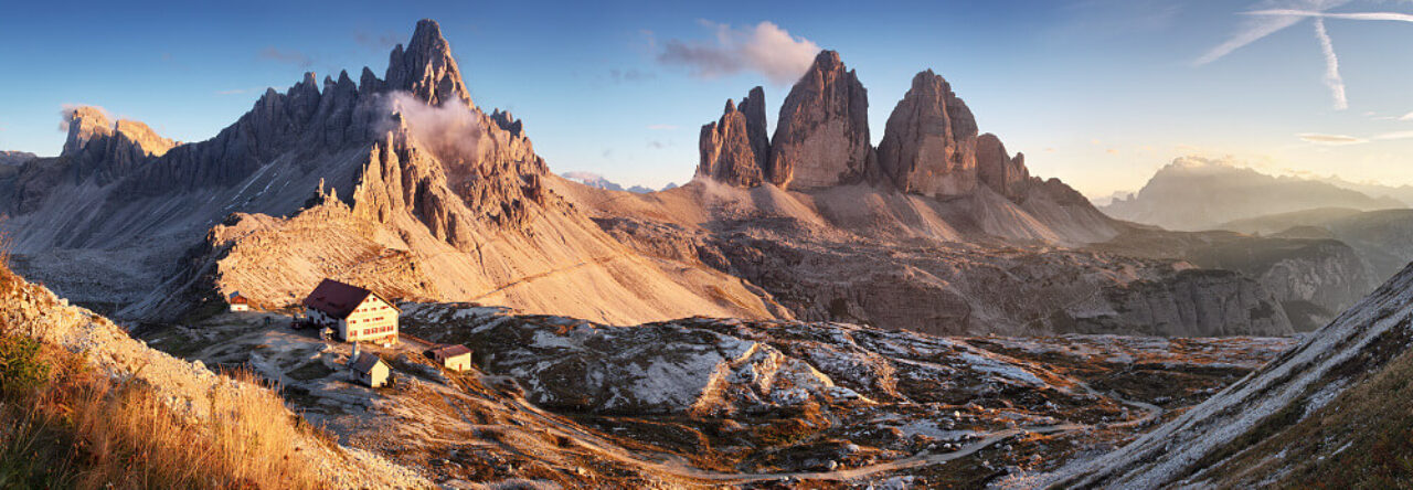
You can also add a Header Image to display a large photograph at the top of your site. If you add both a video and an image, the image will be used as a placeholder to display while the video loads, and will be shown instead of the video on smaller screens where video may be harder to serve over mobile networks.
Front Page
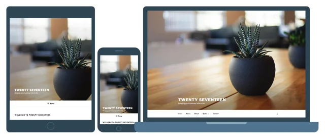
Twenty Seventeen allows you to build a striking paneled front page made up of content from different pages on your site. Each page’s Featured Image is highlighted, and displayed at full-screen size and with a fixed position. Twenty Seventeen has four different sections to which you can assign pages.
Here’s a breakdown of the theme’s front page, as shown on Twenty Seventeen’s demo.

To set your site up like this, start by navigating to Customizer → Static Front Page, and set your site to use a static front page if you haven’t already.

Next, navigate to Customizer → Theme Options. Under each “Front Page Section # Content” header, select the page you’d like to display for that section.

If you haven’t created any pages yet, you can do that from the Customizer by clicking + Add New Page beneath one of the sections. This will allow you to create a new page from the Customizer, to which you can later add content.
For the best appearance, make sure each page includes a featured image along with some other content.
You can also select your Blog Posts page, to have the panel display your three latest blog posts.

Once you’ve finished adding pages to the different sections, click Save & Publish.
Language Support
Twenty Seventeen includes optimal font styles for many languages, thanks to feedback from the WordPress community. The theme uses Libre Franklin by default, and makes adjustments to the typography for the following alphabets:
- Arabic
- Chinese
- Cyrillic
- Devanagari
- Greek
- Gujarati
- Hebrew
- Japanese
- Korean
- Thai
Twenty Seventeen also removes its letter-spacing styles for all non-Latin alphabets to improve legibility.
One- and Two-Column Layouts
On pages, Twenty Seventeen allows you to pick between a one- and two-column layout. This is a global setting rather than something you set per-page, and is managed in Customizer → Theme Options.

The theme defaults to the two-column layout, which displays the page title in one column and the page content in the other.

When the one-column layout is selected, both the page title and content display in a wider single column, centered on the page.

If you change the columns, it will be applied to all pages, search results and archives. The blog posts page will always display as two columns, and the single blog posts will display as one column, unless widgets are added.
Widgets
Twenty Seventeen includes two widget areas in the footer, where you can add widgets below the site’s content.

The blog, archive, search, and single blog posts also include a sidebar widget area. When enabled, the content will appear in one column, and the widgets in the other. This happens even if you’re using the one column layout.
Pullquotes
Pullquotes (or “blockquotes”) can be used to direct your readers’ attention to a particular passage, or to add visual interest to posts and pages. In Twenty Seventeen, you can pair a pullquote with an alignleft or alignright class to highlight it further. You can add this effect in the HTML Editor. An example would be:
|
1 2 3 4 |
<blockquote class="alignleft"> This is my fabulous left-aligned pullquote. </blockquote> |
When a two-column layout is used (either through a setting in the Customizer, or when there are sidebar widgets), an aligned blockquote will appear completely within the sidebar. There are some examples of this below:

Blog posts page with left-aligned pullquote.

Single post with right-aligned blockquote, and sidebar widget.
Post Formats
Twenty Seventeen supports post formats; each displays in a unique way on the blog posts page:
- Aside – indented for short posts, the Aside format will display without a title.
- Audio – displays the first embedded audio player. Readers can see the rest of the post by clicking through to the single post view. If no audio player is added, the blog posts page will display the post’s full content.
- Gallery – displays the first gallery embedded in the post. Readers can see the rest of the post by clicking through to the single post view. If no gallery is added, the blog posts page will display the post’s full content instead.
- Image – displays the post’s Featured Image. Readers can see the rest of the post by clicking through to the single post view. If no Featured Image is added, the blog posts page will display the post’s full content instead.
- Link – has a similar appearance to standard posts.
- Quote – has a similar appearance to standard posts, but displays a “quote” icon next to any blockquotes.
- Video – displays the first embedded video in the post.Readers can see the rest of the post by clicking through to the single post view. If no video is added, the blog posts page will display the post’s full content instead.
Below are examples of each post format:
#gallery-33681-1 {
margin: auto;
}
#gallery-33681-1 .gallery-item {
float: left;
margin-top: 10px;
text-align: center;
width: 50%;
}
#gallery-33681-1 img {
border: 2px solid #cfcfcf;
}
#gallery-33681-1 .gallery-caption {
margin-left: 0;
}
/* see gallery_shortcode() in wp-includes/media.php */

- Aside

- Audio

- Gallery

- Standard

- Image

- Link, with featured image

- Quote

- Video

Content Options
Twenty Seventeen supports Content Options, so you can:
- Switch the blog posts page from displaying the post content (default) to displaying excerpts. Note: Because the image, video, audio and gallery post formats don’t display the regular post content on the blog posts page, this setting will not affect them. See the “Post Formats” section above for more information.
- Hide date, categories, tags, and author using Post Details.
- Hide Featured images on blog, archive, single posts, and/or pages.
Custom Menu
There is space for one Custom Menu in the theme’s header area. On the front page, the menu will appear below the Header Image or Header Video.
On larger screens, the menu will stick to the top of the page as you scroll down if it has no more than two rows of links. If there are three rows of links or more, the menu will remain fixed at the top of the page, to make sure it doesn’t cover too much of your site’s content.
Social Links Menu
Twenty Seventeen includes a Social Links Menu, where you can add links to your social media profiles. These will be displayed as logos in the footer:

The following services are supported by Twenty Seventeen’s Social Icons Menu:
- Behance
- Codepen
- DeviantArt
- Digg
- Dribbble
- Dropbox
- Flickr
- Foursquare
- GitHub
- Google+
- Meanpath
- Medium
- Skype
- SlideShare
- Snapchat
- SoundCloud
- Spotify
- StumbleUpon
- Tumblr
- Twitch
- Vimeo
- Vine
- VK
- WordPress
- Yelp
- YouTube
Custom Colors
Twenty Seventeen supports Custom Colors, and has six free palettes available for you to choose from.
#gallery-33681-2 {
margin: auto;
}
#gallery-33681-2 .gallery-item {
float: left;
margin-top: 10px;
text-align: center;
width: 33%;
}
#gallery-33681-2 img {
border: 2px solid #cfcfcf;
}
#gallery-33681-2 .gallery-caption {
margin-left: 0;
}
/* see gallery_shortcode() in wp-includes/media.php */


Quick Specs (all measurements in pixels)
- The main column width is up to
525wide with the two column layout, or up to740wide with the one column layout. - The sidebar column width is up to
326. - The recommended Featured Image size is
2000wide by1200high. - The recommended Header Video and Header Image sizes are
2000wide by1200high.
Napsat komentář